Figma's Auto Layout is your new best friend! It's like magic for making your designs adjust perfectly, whether someone's on a giant computer or a tiny phone.
In this guide, we'll break down Figma Auto Layout step-by-step so you can create designs that are flexible, consistent, and professional no matter where they're viewed.
Ready to become a responsive design pro? Let's dive in!
Understanding the Basics of Auto Layout
Okay, so what exactly is Auto Layout? Think of it like an invisible box in Figma that organizes stuff inside it.
This box, or auto layout frame, automatically arranges things like pictures, text, or buttons so they always look good no matter how big or small the box gets.
This is super helpful for making websites and apps that look great on any screen! Here's the breakdown of the important parts:
Direction: Imagine lining up your friends for a photo. You can have them stand in a row (that's like horizontal auto layout) or in a line, one behind the other (that's like vertical auto-layout). Auto Layout lets you choose how things are arranged in your auto layout frame.
Spacing: This is like deciding how much space to leave between your friends in that photo. You can squish them together or spread them far apart. Auto Layout lets you control the space between things in your design.
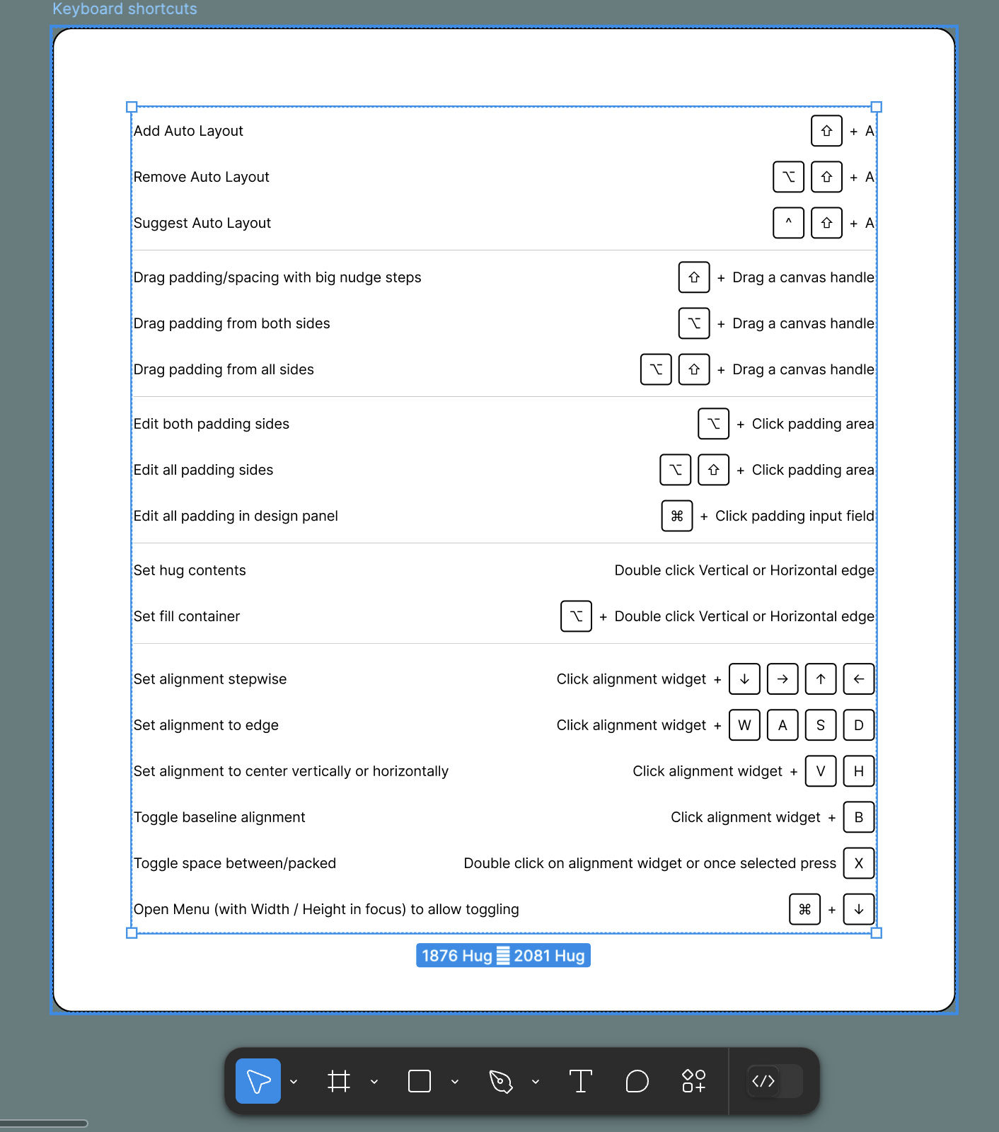
Padding: Imagine your photo has a frame around it. Padding is like the space between the picture and the frame's edge. In Auto Layout, padding is the space between the stuff inside your box and the edges of the box.
Alignment: This is like deciding where your friends should stand within the photo. Should they all be at the top, bottom, or in the middle? Auto Layout lets you choose how things line up inside the box.
Ready to see the Figma auto layout feature in action? Let's create a simple button with an icon and some text using Auto Layout.
Mastering Auto Layout Properties
Alright, now that you've dipped your toes into Auto Layout, let's dive deeper and explore the cool things you can do with it!
Think of these properties as the settings that control how your auto layout frame behaves.
Hug Contents: Imagine you have a gift box, and you want it to fit the toy inside perfectly. That's what "Hug Contents" does! It lets the stuff inside the auto layout frame decide how big the frame itself should be.
Fill Container: Now, imagine you have that same toy, but you want it to stretch and fill the entire gift box, no matter how big the box is. That's "Fill Container"! It makes the things inside your frame expand to take up all the available space.
Fixed Width/Height: Sometimes, you want your toy to be a specific size, no matter what size box it's in. "Fixed Width/Height" lets you set exact sizes for things inside your auto layout frame.
But wait, there's more! Auto Layout has some extra cool features:
Constraints: These are like rules that tell things inside your frame how to behave when the frame changes size. Should they stick to the left side? The right? Should they stretch or shrink? Constraints give you tons of control!
Wrapping: Imagine you have a bunch of marbles in your box. If the box gets too small, the marbles will start to form a new row, right? That's what "Wrapping" does! It makes things in your frame move to the next line if they run out of space.
Minimum and Maximum Width/Height: This is like setting boundaries for your toy. You can say, "This toy can't be smaller than this, and it can't be bigger than that." You can set size limits for things inside your auto layout frame.
To apply auto layout and really understand how these properties work, let's look at some examples.
(Here, you would include GIFs or short videos showing how each property affects a layout. You can also use before-and-after images to show the impact of different property combinations).
Remember those nested auto-layout frames we talked about earlier? You can add auto layout to frames within frames, and each of those frames can have its own set of properties.
It's like putting a smaller gift box inside a bigger one! This lets you create super complex layouts, but it's important to keep things organized.
Think of the biggest frame as the "parent frame" and the smaller ones inside as the "children."
By mastering these properties, you'll be well on your way to creating awesome, responsive designs in Figma!
Responsive Design with Auto Layout
Okay, so we've learned the building blocks. Now, let's see how auto layout in Figma can help us build designs that look amazing on any screen, whether it's a phone, a tablet, or a massive computer monitor!
Constraints are Key: Remember those "rules" we talked about? Constraints are like superpowers for responsive design! They tell elements in your auto layout frame how to behave when the frame changes size. Think of it like this: you have a picture on your wall, and you want it to stay centered even if you make the wall bigger. Constraints can make that happen!
Breakpoints are Your Friends: Imagine you're building with LEGOs. You might use bricks of different sizes depending on what you're building, right? Breakpoints are like that! They let you create different layouts for various screen sizes. So, your design can look one way on a phone and a totally different way on a big screen, all thanks to the auto layout in Figma.
Text That Adapts: Have you ever noticed how text on websites sometimes gets bigger or smaller depending on your screen? That's responsive typography! With auto layout in Figma, you can make text change size and spacing so it's always easy to read, no matter how big or small the screen is.
Plan for Different Screens: Before you start designing, think about how your design will look on different devices. It's like planning a party – you need to know how many people are coming so you can set up enough chairs and snacks! Start with the smallest screen (like a phone) and work your way up. This way, you make sure your design looks awesome everywhere.
Here are some tips to keep in mind when using the auto layout in Figma for responsive design:
Don't Overdo It: While nested auto layout is powerful (remember those boxes within boxes?), too many layers can make your design complicated. Please keep it simple!
Combine with Components: Components are like reusable building blocks in Figma. Combine them with Auto Layout, and you have a recipe for super-efficient design! It's like having a set of LEGO instructions that you can use to build the same thing over and over again.
Experiment with auto layout properties: Don't be afraid to play around with different settings! Try different combinations of constraints, padding, and spacing to see what works best for your design.
Remember Absolute Position: Sometimes, you might need to place something outside of the flow of Auto Layout. That's where absolute positioning comes in. It's like breaking the rules and putting something exactly where you want it, regardless of the layout. But use it sparingly!
By mastering these techniques and combining them with the auto layout feature, you'll be creating amazing, responsive designs in no time!
Advanced Auto Layout Techniques
You're doing great! By now, you've got a good grasp of how auto layout works. But just like leveling up in a video game, there are always more skills to unlock!
Let's explore some advanced techniques to master auto layout and become a true Figma pro.
Nested Auto Layouts: The Power of Boxes within Boxes: Remember those Russian nesting dolls? You open one, and there's another inside, and another, and another! The nested auto layout is similar. You can put an auto layout inside another auto layout frame. This is super helpful for creating complex layouts, like a website with a sidebar, a main content area, and lots of different sections. Just remember to keep things organized, or you might get lost in all those boxes!
Components and Auto Layout: A Dynamic Duo: Components are like reusable building blocks in Figma. Combine them with Auto Layout, and you've got a superpower combo! Imagine you're designing a button. You can create a component for it with an auto layout inside, so the text and icon always stay perfectly aligned, no matter what size the button is. Then, you can reuse that button throughout your design, and it will always be responsive!
Variants and Auto Layout: Bringing Your Designs to Life: Variants are like different versions of the same thing. Think of a light switch – it has an "on" state and an "off" state. With variants, you can create different states for your designs, like a button that changes color when you hover over it. Combine this with Auto Layout, and you can create complex interactive elements, like dropdown menus or toggle switches, that also adapt to different screen sizes!
Here's how these advanced techniques can help you create responsive designs:
Organization is Key: Nested auto layout can get complex. Think of it like organizing your toys. You wouldn't just throw them all in a box, right? You'd probably use smaller boxes to separate different types of toys. Do the same with your designs! Use clear names for your frames and layers to keep everything organized.
Efficiency is Your Friend: Components and Auto Layout are a time-saving dream team! Instead of recreating the same elements over and over, you can create a component once and reuse it everywhere. Plus, with auto layout inside, your components will automatically change different screen sizes, saving you even more time!
Think Beyond Static Layouts: With variants and Auto Layout, you can create responsive designs that are not only adaptable but also interactive. You can design elements that respond to user actions, like clicks or hovers, while still looking great on any screen size.
Remember the fill container property? This is especially useful when working with child objects in nested auto-layout frames.
You can make elements stretch to fill the available space within their parent frame, creating a flexible and dynamic layout.
By mastering these advanced Auto Layout techniques, you'll be able to tackle even the most complex design challenges and create responsive designs that are both beautiful and user-
friendly!
Real-World Examples and Case Studies
Alright, it's time to see Auto Layout in action! Let's take a look at some websites and apps that use this awesome Figma feature to create super cool and adaptable designs.
E-commerce Giants: Ever shopped online? Big websites like Amazon use Auto Layout to display tons of products in a way that looks good on any screen. Imagine a grid of shoes that magically rearranges itself whether you're on your phone or your computer – that's Auto Layout working its magic! They also use it for things like image carousels and product filters, so you can easily find what you're looking for.
Social Media Stars: Think about apps like Instagram or Facebook. They use Auto Layout to make sure posts, stories, and profiles look awesome on different phones and tablets. This way, everyone has a smooth experience whether they have a brand-new or old phone.
Mobile Apps That Adapt: Many games and productivity apps use Auto Layout to create interfaces that adjust to different screen sizes and orientations. Imagine playing a game on the phone & then switching to a tablet – the buttons and menus would rearrange themselves so you can still play easily. That's the power of responsive design with Auto Layout!
But here's the exciting part: You don't have to be a giant company to use Auto Layout effectively. In fact, platforms like Buzzy make it super easy for anyone to create responsive designs, even without any coding experience!
Buzzy and Auto Layout: A Perfect Match: Buzzy lets you transform your Figma designs into real websites and apps. By using Auto Layout in your Figma designs, you can ensure that your Buzzy creations will look fantastic and function flawlessly on any device. This means you can quickly build and launch responsive websites and apps without needing to write a single line of code!
Think of it like this: you design a cool layout in Figma using Auto Layout, and then Buzzy takes your design and turns it into a real, working website or app that automatically adjusts to different screens. How cool is that?
By combining the power of Figma's Auto Layout with Buzzy's user-friendly tools, you can bring your design ideas to life and create responsive experiences that will impress your audience.
So, what are you waiting for? Start exploring these amazing tools and unlock your design potential!
Tips and Troubleshooting
You're almost an Auto Layout expert! But even pros run into a few bumps in the road sometimes.
Here are some tips to help you avoid common problems and keep your designs running smoothly.
Don't Overdo It: Remember those nested Auto Layouts (boxes within boxes)? While they're super helpful, using too many can make your design messy and hard to work with. It's like building a tower with too many blocks – it might get wobbly! So, try to keep your Auto Layout structure as simple as possible.
Name Your Layers: Imagine you have a box of crayons, but they're all mixed up with no labels. It would be hard to find the color you want, right? The same goes for your Figma designs! Give your frames and layers clear, descriptive names so you can easily find what you're looking for.
Check Your Constraints: Constraints are like the rules that govern your Auto Layout. Make sure you've set them correctly, or things might not behave the way you expect. It's like playing a game with the wrong rules – it won't be much fun!
Performance Matters: If your design has a lot of layers and Auto Layouts, it might start to slow down. Think of it like a computer with too many programs running – it can get sluggish! To keep things running smoothly, try to optimize your design by simplifying complex layouts and using components whenever possible.
Troubleshooting Time: Even with the best planning, things can sometimes go wrong. If your Auto Layout isn't behaving the way you want, don't panic! Here are some things to check:
Are your constraints set correctly?
Do you have any conflicting properties?
Are your layers named clearly?
Have you tried restarting Figma? (Sometimes, a simple refresh can fix things!)
If you're still stuck, don't worry! There are so many helpful resources available online. The Figma community forum is a great place to ask questions and get help from other designers.
You can also find tutorials and documentation on the Figma website.
Remember, practice makes perfect! The more you use Auto Layout, the better you'll become at it.
So, keep experimenting, keep learning, & keep creating awesome responsive designs!
Conclusion
You did it! You've learned how Figma's Auto Layout can help you create designs that look awesome on any screen.
It's like a magic box that arranges things perfectly on everything from tiny phones to huge computers.
You've explored cool tricks like constraints, breakpoints, and nesting Auto Layouts. Now, you can create layouts that are flexible and look professional everywhere.
Keep playing with Auto Layout and see what you can create. The more you practice, the better you'll get.
Now, go out there and design amazing things! The world is waiting to see what you come up with.
Frequently Asked Questions
When should I use Auto Layout in my designs?
Auto Layout is your go-to for anything that needs to simply adapt to different screen sizes or content changes. Think responsive buttons, navigation menus, card layouts, or even image galleries. If you want your design to flex and adjust gracefully, Auto Layout is your friend!
Can I combine Auto Layout with other Figma features?
Absolutely! Auto Layout plays well with other Figma features like components and variants. You can create reusable UI elements with built-in responsiveness using components or design interactive elements with different states using variants, all within an Auto Layout frame.
What's the difference between padding and spacing in Auto Layout?
Think of padding as the space inside your Auto Layout frame, like the margins within a picture frame. Spacing, on the other hand, is the space between the elements within your frame, like the gaps between photos on a wall.
How do I prevent my Auto Layout from getting too complex and messy?
Avoid overusing nested Auto Layouts (frames within frames). Start with a simple structure and only add complexity when needed. Also, use clear and descriptive names for your layers and frames to keep things organized.
Where can I find more resources to learn about Auto Layout?
Figma has excellent documentation and tutorials on its website. You can also find helpful articles, videos, and community discussions on platforms like YouTube, Medium, and the Figma community forum. Don't hesitate to ask questions & learn from other designers!